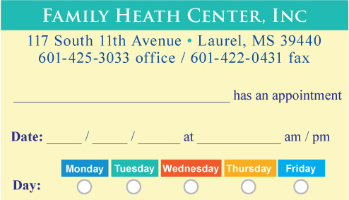
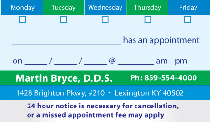
Fonts used in designing appointment cards -
Serif and Sans-Serif Fonts
There are multiple font styles that can be used
in the creation of appointment cards, with the two
primary font styles being serif and non-serif fonts.
A serif fonts is one with little squiggly markings
at the ends of the letters. These are place in
strategic places on the font letters to make the
letters appear to flow more smoothly together. This
can be particularly useful for long passages of text
where you would want text to flow like this for
greater and faster comprehension.
Clearly, this would not be needed with the small
amount of text that is going to be placed on a
standard 2 x 3.5 inch appointment card, as there is
only so much text that can be place in such a small,
confined area. A common sans-serif font is Arial,
which is just about on all modern computers today.
Sans means "without" in French, so these types of
fonts do not have the squiggly items are the ends of
the fonts. Traditionally, these fonts are meant for
small headings as in the main headings and bylines
of a news paper or magazine. They attract more
attention as the font is not flowing as evenly as
with serif fonts. This forces the ready to spend
more time in examining the letters. This may be the
effect that we would want for making appointment
cards, as we want the text to be prominent.
There is also the choice of artistic text for the
fonts, but once has to be careful about going
overboard as these are meant for main headings only
(such as your office’s name). They are never mean to
be use for main text.


![]()