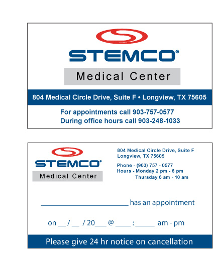
Only so much information can be squeezed onto a traditional appointment reminder cards, even when such card are double sided as with the cards that we offer. When you add graphic design placement issues into the mix then it can get really tricky. Many established medical and dental offices have their logo which they will often want to place on their cards. This can raise issues like: Was this design created professionally and did the designer supply high end, high resolution files like PDF or EPS which are need for 4-color process printing? So many times people have gotten their logos in formats like GIF or JPEG at just one low-resolution size, and they are surprised when they are told that such images cannot be used because they are not of sufficient quality. If you are going to get a logo for your medical or dental office, then get it done right and make sure the your designer supplies the logo in these formats: EPS, PDF, TIFF, AI or CorelDraw.
Once you have your logo in the correct format, then you need to make sure that it is optimally placed on the appointment card...large enough to be seen with all the text readable, but not large enough that it completely overwhelms the already extremely limited space on the 2 x 3.5 inch card. Having 2-side printed greately enhances the odds of having a successful design. Perhaps the best option is to have the logo on the front side with the appointment info, address and fill-in area on the reverse side of the cards. One very difficult task is to have to place all major elements on one side of the card. Using the same graphic from our previous lesson on color coded appointment cards, we can see that all elements were successfully placed on one side of the card. This customer had her logon in JPEG format on her website and did not have thee requisite EPS, TIFF or PDF files that are really need for high end placement. Luckily, we were able to use Photoshop to pull in the design and use the image feature to change the dots per inch (DPI) to 300 without upsampling the image. In this particular case the image fitted perfectly within the confirmed spacial dimensions. If you make the mistake and make the logo too large then you defeat the whole purpose of the design and it ceases to be a functional card for your office. You don't want the fill-in area so small that it is hard to legibly write in, and you especially do not want your contact info so small that your patients cannot clearly see your phone number should they need to reschedule their appointment times.
If you have a multi date appointment card, then it comes close to being impossible to successfully place all elements unless you specifically use the two-sided design style. Same issues apply with multi lingual designs.


![]()